Hola!
I'm Meg!

My world is very colorful—literally.
I have synesthesia, which means every sensory input is associated with colors. And colors have textures, temperatures, sounds, and personalities.
To my greatest surprise, one day I discovered that not everyone see numbers, sounds and space in color. For most people 3 is a number. For me is a pink number.
This is why when I became curious about perception, and for the past 20+ years, I've studied everything from perception, color science, hypnosis, to dream psychology and everything in between.
II spent years photographing people and everything I could find. I was a resort photographer for a couple of seasons, exhibited paintings, and spent the past few years immersed in brand strategy.
,
I love experiencing places, observing how color, light, and sensory perception collide, and honestly, I can't get enough of it.

The ChromaSense Method
What if blue is not just blue?
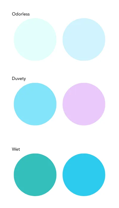
Colors aren't just colors. To anyone.
One day, while in Fine Arts, I casually discovered that my friends don't experience names in colors. I'd never questioned it. Until then.
That started my exploration of perception, neuroaesthetics, and color science — a thesis in 2013, and the work I do today.
Because color doesn't just look like something. It feels, sounds, and means something at a biological level. It makes people feel, not just see.
And branding is all about feelings.
Salty
Fragrant
Soft
Loud
Sour
Colors aren't just colors. To anyone.
While in Fine Arts, one day a friend stared at me blankly when I casually mentioned that people's names have colors. It was just the way things were for me. I never questioned it. Until then.
That's what started my exploration of perception, neuroaesthetics, and color science — a thesis in 2013, and the work I do today.
Because color doesn't just look like something. It feels, sounds, and means something at a biological level. It makes people feel, not just see. And branding is all about feelings.
THE ORIGIN STORY
Research & Practice
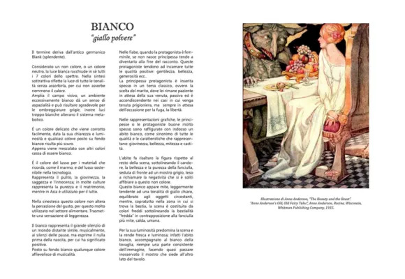
Research on associations between color and fairy tales (archetypes), 2010
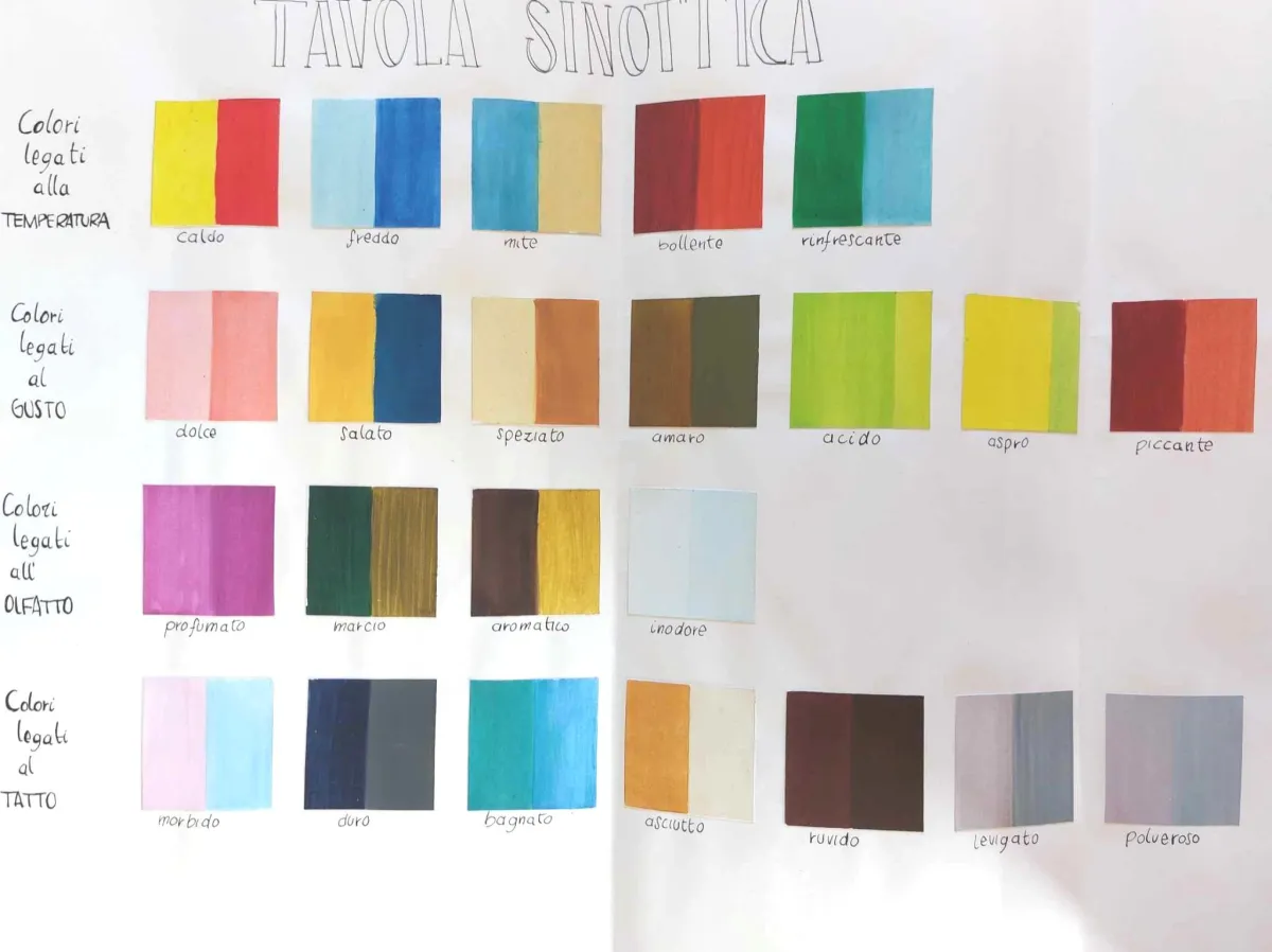
Research on color combinations that activate sensations - Synesthesia Table, 2011
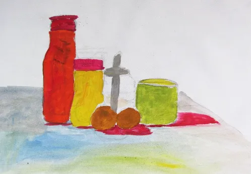
Painting Experiment on scotopic vision for my thesis "Color Perception and the Anomalous Mind", 2013
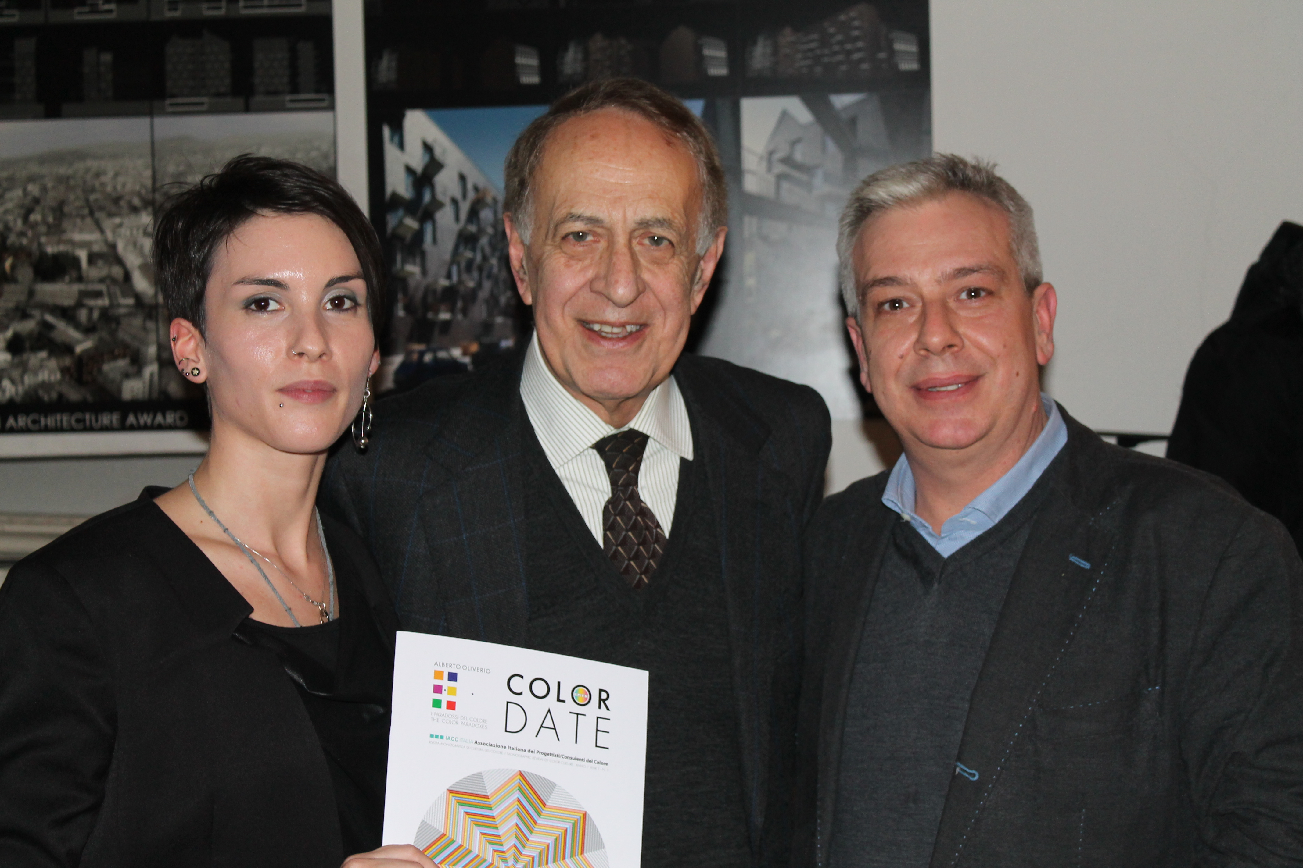
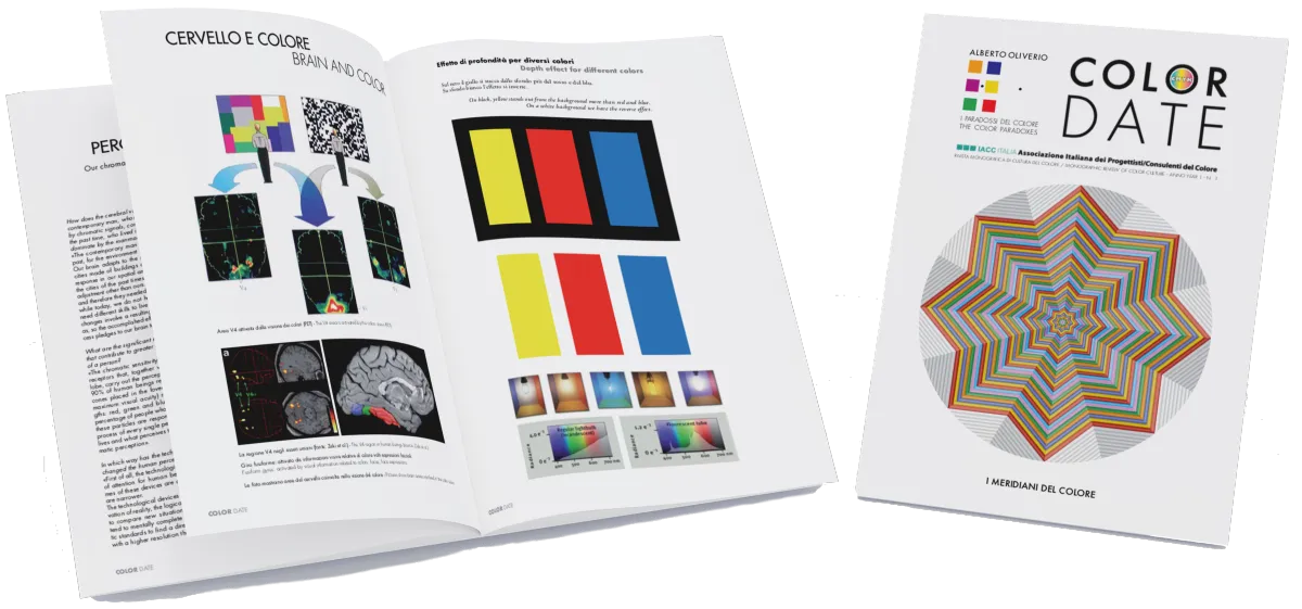
Interview with neuroscientist A. Oliverio, for Color Date, 2014
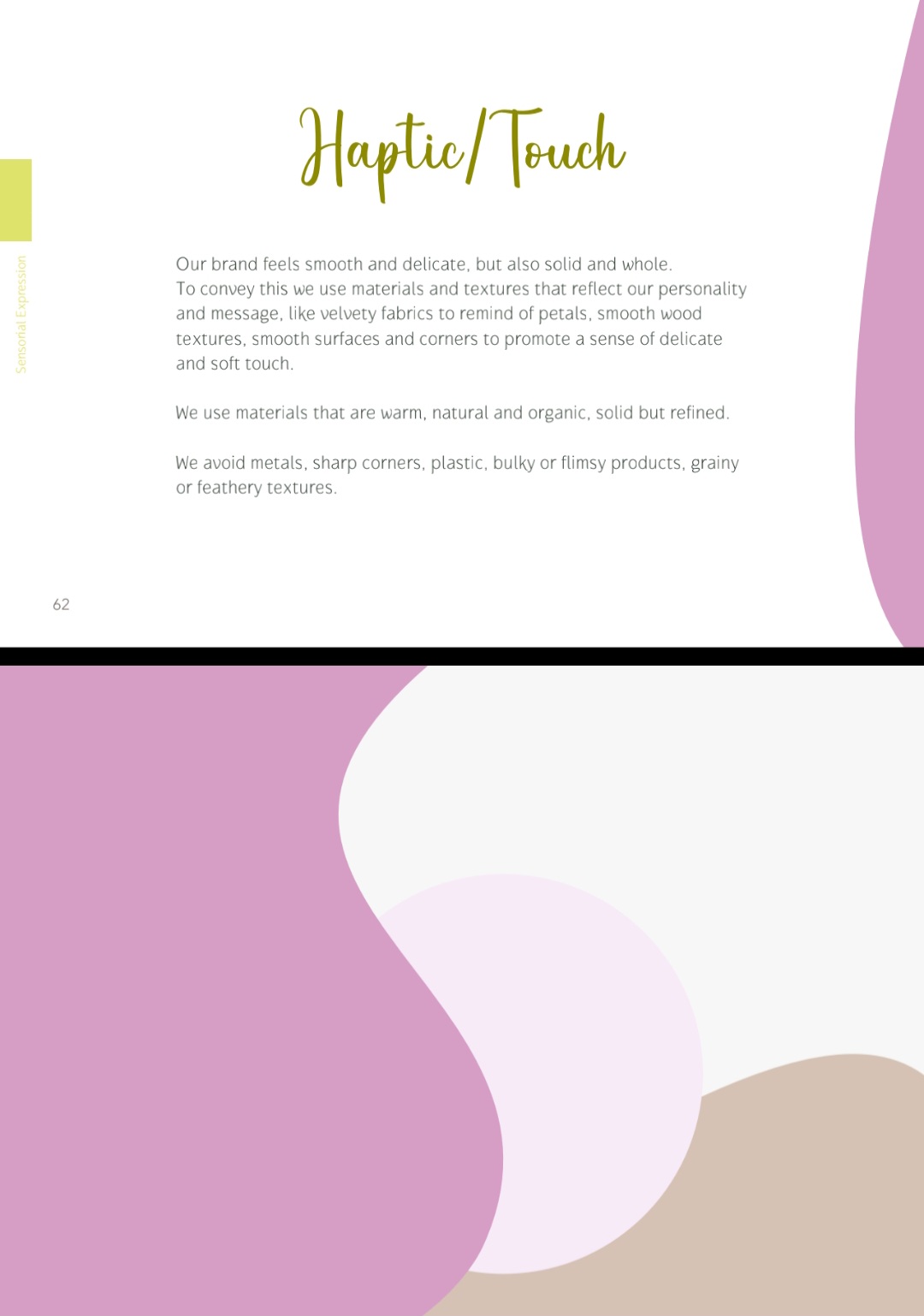
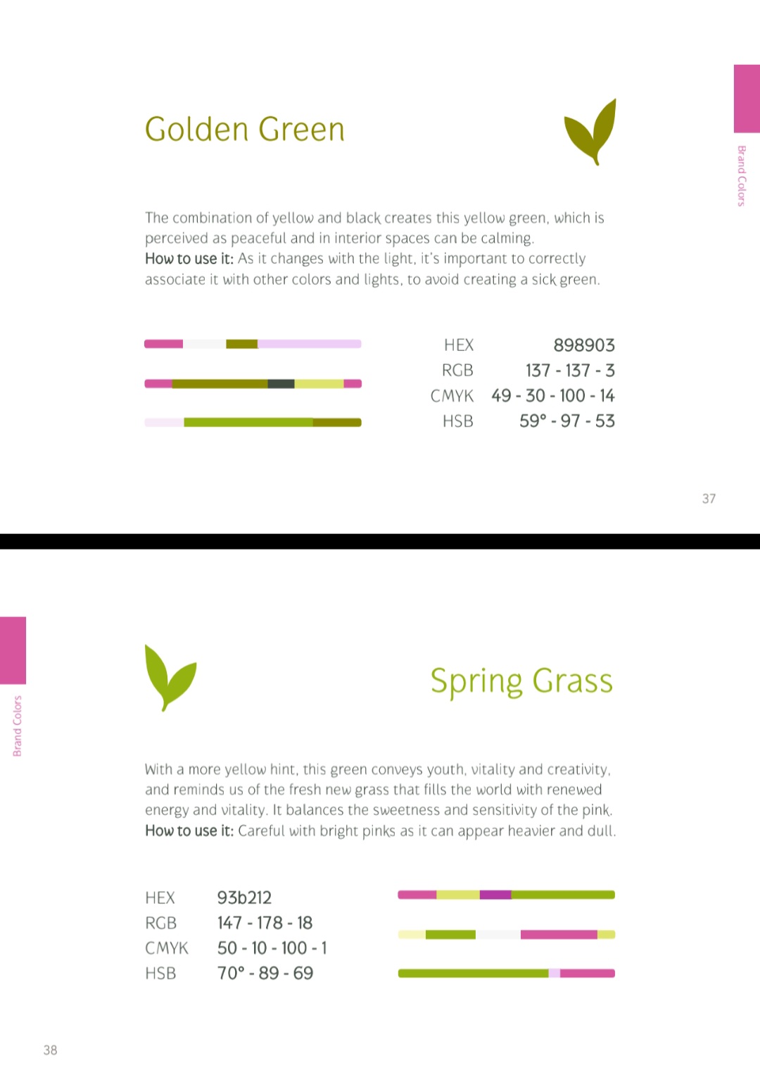
Color strategies applied to wellness brand "Jillian's Healing Arts Center", 2023
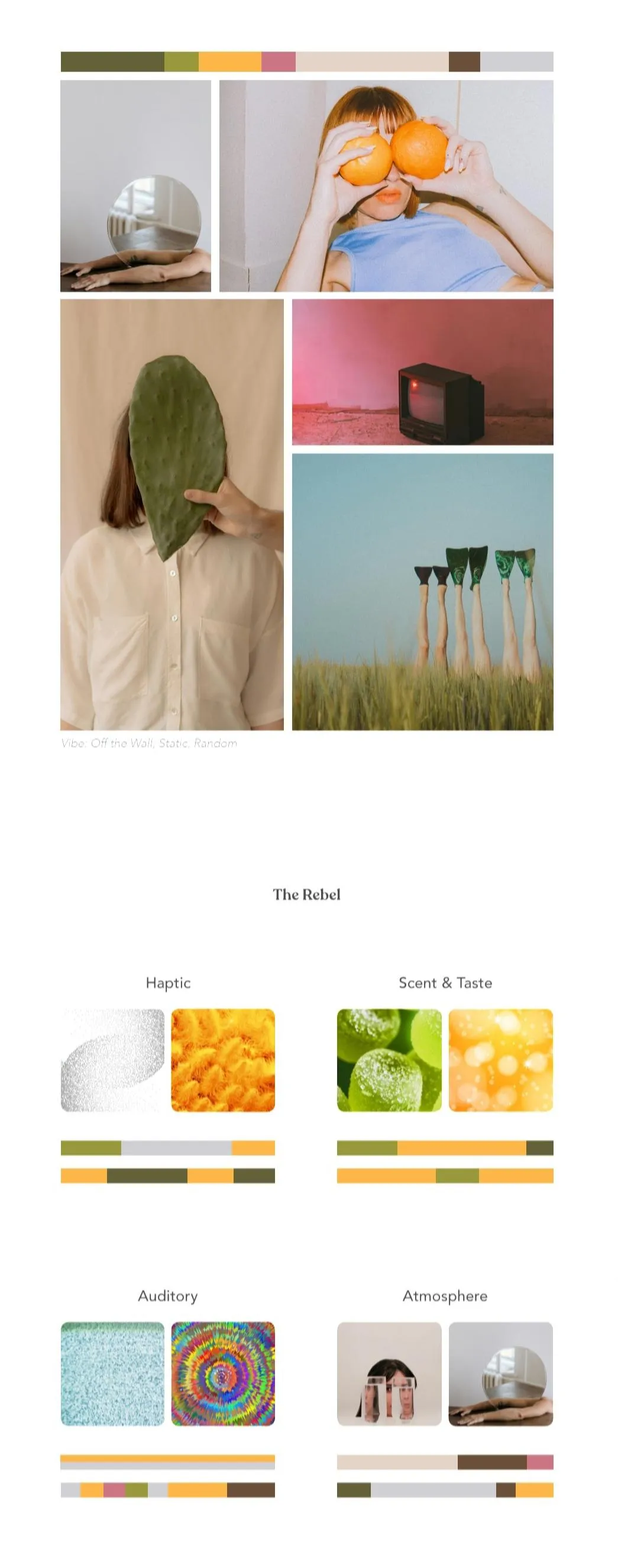
Published my book "Colors & Fairy Tales" on the usage of color for multisensory advertising and branding, 2024
THE FOUNDATION
A Science-Based System
The framework draws from perception science, Gestalt psychology, neuroaesthetics, and Jungian archetype theory to build experiences that operate at a subconscious level, before logic, language or any conscious thought.
🧠
PERCEPTION & BRAIN SCIENCE
How the brain processes color, form, and sensory input — before any conscious thought occurs. Why some experiences feel coherent and others feel "off." It's how the visual cortex and the limbic system process stimuli before the prefrontal cortex even gets involved.
🔮
JUNGIAN ARCHETYPE PSYCHOLOGY
The 12 brand archetypes as psychological energy systems — not surface labels or just aesthetics. Rooted in Jung's theory iof the collective unconscious, archetypes are patterns we all already recognize, at a deeper level than personal taste. These patterns build trust and familiarity, or create discomfort.
🎨
CHROMASENSORY PALETTE
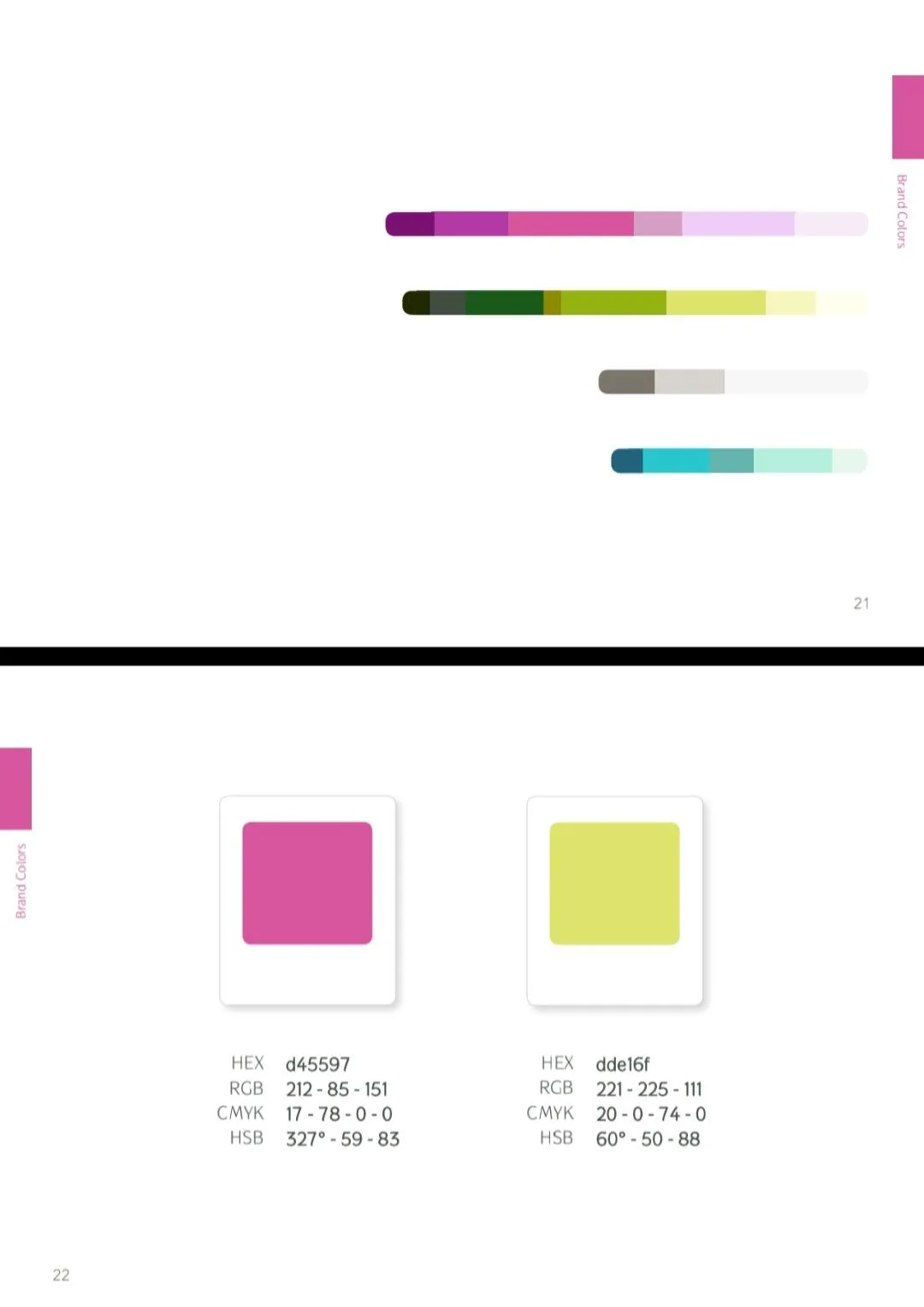
How color works as a multisensory signal — affecting taste, sound, temperature, and memory. Designing color systems that work across all senses makes your brand more inclusive and more impactful for everyone.
🌈 PLAY & CREATE APPROACH
Learning through play boosts creativity, understanding, and retention. Creativity strengthens problem-solving and resilience, The brain absorbs more when it's building, experimenting, and having fun, and life is more enjoyable this way.
JILLIAN'S HEALING ARTS CENTER
Applied ChromaSense
Jillian runs a wellness studio. She is also visually impaired.
She needed a brand that helped her make confident decisions across every touchpoint: what to wear for TV, which materials to choose, how to speak publicly about the studio.
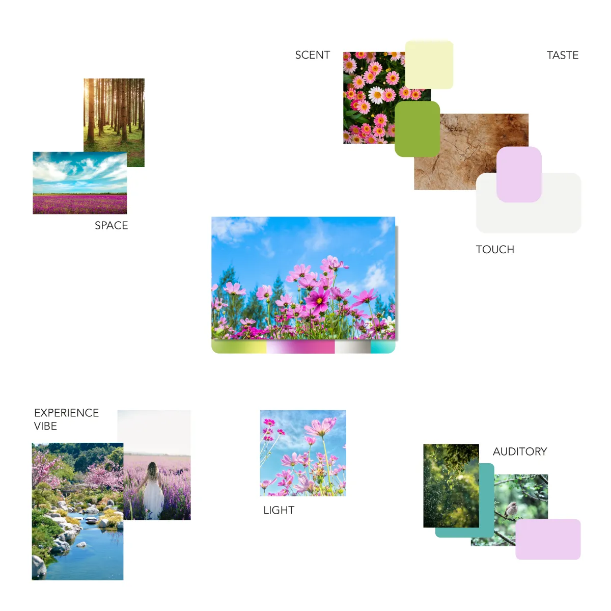
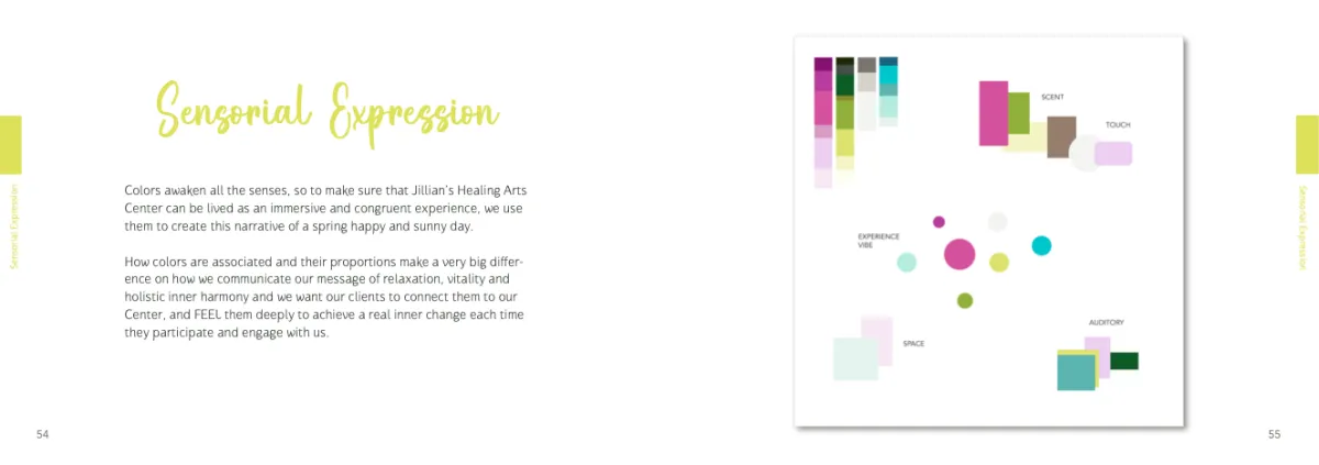
We built a sensory brand strategy. Not a logo. A complete framework: color palette, material direction, spatial experience, communication tone.
⭐ ⭐ ⭐ ⭐ ⭐
"Thank you for your help! I already knew which towels to buy, which materials would fit perfectly. The interview was the easiest thing I've done for the public. I already knew what to wear and what to say."
Jillian
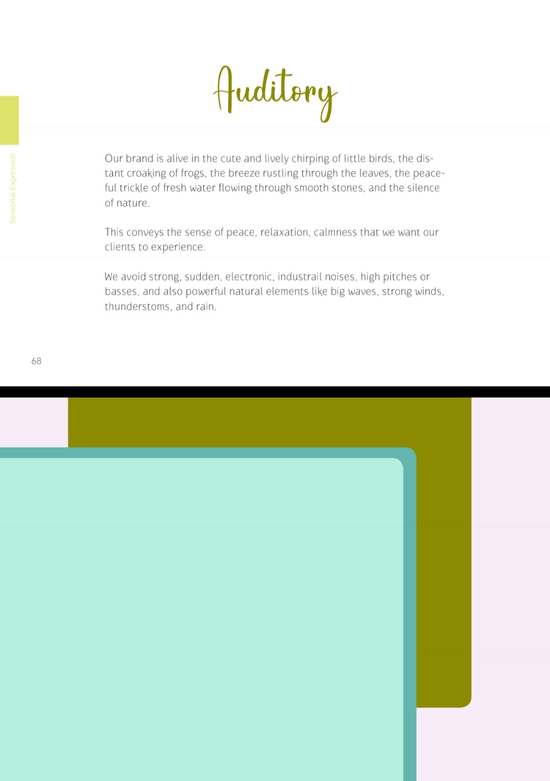
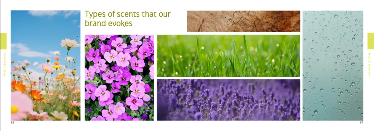
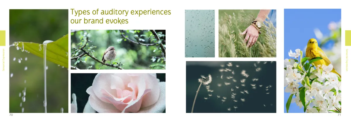
People don't need to see your brand to feel it.
A multisensory approach makes experiences more accessible, more inclusive, more memorable — for everyone.
FOR ACCESSIBILITY & INCLUSION
Beyond Visuals
Most brands rely almost entirely on visual perception — excluding millions of people and limiting emotional impact for everyone.
A multisensory approach changes that.
When your brand engages multiple senses — not just sight — it becomes:

More immersive and memorable for everyone
Multisensory experiences engage the brain more deeply, keeping people more grounded in the present. This reinforces brand memorability by up to 70% more comparing to visual brands.

More accessible to people with impairments
People who cannot see your brand cannot experience it.
Creating a congruent multisensory system allows everyone–no matter their abilities–to recognize your brand in any context.
More consistent across all touchpoints
It's easier to expand the brand across physical spaces, digital experiences, and spoken communication, while maintaining a consistent experience.
Why color works.
↓ tap each step to explore
Color, light, texture, space, composition — these are the first signals your brain receives. Before words, before logic, your audience is already processing what they sense and how it makes them feel.
Your brand is speaking before you say a single word. The question is — what is it saying?
When external stimuli interact with our internal system through the senses, the brain reads those sensations as feelings. It prioritizes the stimuli "important" enough to capture its attention and decode.
Coral feels warm, alive, energetic. Cold blue feels clinical. Your audience doesn't decide this — they just feel it.
The brain searches for familiar archetypes — deeply ingrained patterns rooted in life experience, culture, and values. The more congruent the signals, the stronger the archetype activates.
Bright colors. Loud. Fun. You immediately know what energy to expect.
Feels completely different, doesn't it? Different expectations. Different experience.
Meaningful, familiar patterns feel safer and more trustworthy than the unknown. When there's no contradiction between what you say (conscious) and what they sense (subconscious), people trust you — all signals are consistent.
These aren't conscious thoughts. They're emotional signals that guide decisions before rational evaluation even begins.
Consistency. When your visuals, words, and energy all say the same thing — trust happens automatically.
How we feel influences how we think and behave. The subconscious mind decides before the rational mind reads a word. Decisions are not logical — your audience feels they can trust you first, then they rationalize why.
Color isn't decoration. It's the foundation for the alignment that makes people say yes — before they even know why.
That's why I don't just take pretty photos.
I build visual alignment — intentionally.
THE BOOK
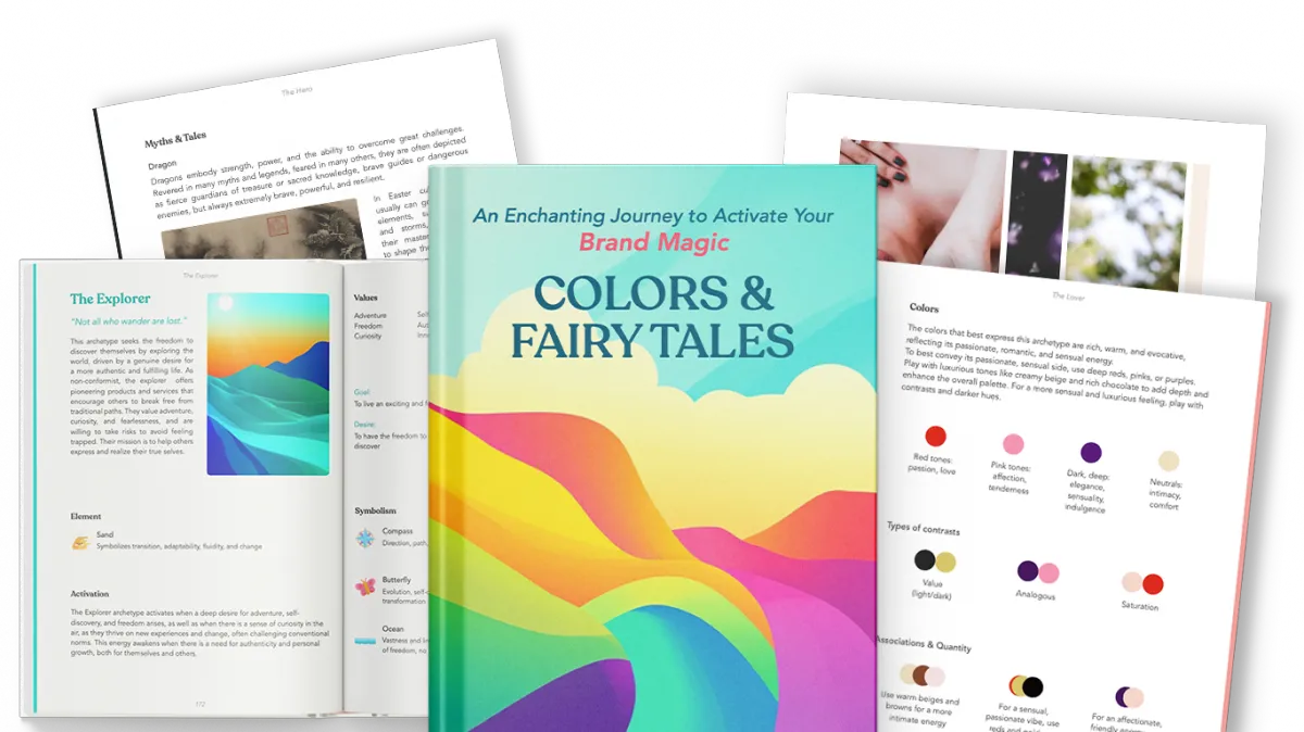
Colors & Fairy Tales
A science-based framework, disguised as a colorful book.
36 archetype deep-dives, sensory moodboards, and the full ChromaSensor Palette method: the same foundation and framework used with my clients, expanded into a complete system you can apply yourself.
Discover colors and branding like you never did before!
NERD MODE
Further Reading
How neurons make meaning: brain mechanisms for embodied and abstract-symbolic semantics:
https://www.sciencedirect.com/science/article/pii/S1364661313001228
Superior pattern processing is the essence of the evolved human brain:
The Influence of Colour on Memory Performance: A Review:
Investigating the effects of color:
Color is in the eye, and brain, of the beholder
https://knowablemagazine.org/content/article/mind/2022/science-of-color-perception
In Living Color: We Remember Scenes Better When they're in Color than in Black and White:
Effects of Light on Attention and Reaction Time: A Systematic Review
Do we feel colours? A systematic review of 128 years of psychological research linking colours and emotions
Different colors of light lead to different adaptation and activation as determined by high-density EEG:
https://www.sciencedirect.com/science/article/abs/pii/S1053811914005485
Brain Responses to Violet, Blue, and Green Monochromatic Light Exposures in Humans: Prominent Role of Blue Light and the Brainstem
Envision color: Activity patterns in the brain are specific to the color you see
"It Is a Big Spider Web of Things": Sensory Experiences of Autistic Adults in Public Spaces
Sensory Processing Differences in Individuals With Autism Spectrum Disorder: A Narrative Review of Underlying Mechanisms and Sensory-Based Interventions
The impact of applied labeling context on consumer acceptance of differently valenced products:
https://www.sciencedirect.com/science/article/abs/pii/S0950329321003736?via%253Dihub
Brain Waves Predict Success of New Fashion Products: A Practical Application for the Footwear Retailing Industry
https://journals.sagepub.com/doi/abs/10.1177/2394964315569625?journalCode=jcva
Red encourages impulse buying while citrus scents make you spend more: Infographic reveals the tricks stores use to boost sales at Christmas
A Packaging Visual-Gustatory Correspondence Effect: Using Visual Packaging Design to Influence Flavor Perception and Healthy Eating Decisions
https://www.sciencedirect.com/science/article/abs/pii/S0022435919300703
Coloured hearing, colour music, colour organs, and the search for perceptually meaningful correspondences between colour and sound
https://journals.sagepub.com/doi/full/10.1177/20416695221092802
Scientists Made a Song That Literally Makes Chocolate Taste Better
https://www.vice.com/en/article/scientists-made-a-song-that-literally-makes-chocolate-taste-better/
Sniffing This One Specific Scent Can Boost Your Brain’s Gray Matter
https://www.vice.com/en/article/sniffing-this-one-specific-scent-can-boost-your-brains-gray-matter/
How do we remember? Time Traveling Part 1 | Inner Cosmos with David Eagleman
https://www.youtube.com/watch?v=pEtgU6cD82s&list=PLehQbT1G9RIR6t0FZMR3_pmyKcNAWtTLz&index=74&t=16s
Brighter nights and darker days predict higher mortality risk: A prospective analysis of personal light exposure in >88,000 individuals
Current Insights into Optimal Lighting for Promoting Sleep and Circadian Health: Brighter Days and the Importance of Sunlight in the Built Environment
Effects of biophilic indoor environment on stress and anxiety recovery: A between-subjects experiment in virtual reality
https://www.sciencedirect.com/science/article/pii/S0160412019336347
Light Hygiene for Circadian Health: A Molecular Perspective
Autism and Light Sensitivity: Creating a More Inclusive Environment
https://www.superbrightleds.com/blog/Autism-and-light-sensitivity.html
The Color Lab Uncovers the Soothing Effects of Light
https://www.ucdavis.edu/health/news/color-lab-amber-light-eases-stress-anxiety
Circadian light eases recovery in a Swedish neonatal intensive care ward
Pilot study of dynamic lighting and sleep consolidation among older adults in a Jordanian senior care facility
Red or Blue? The Influence of Background Color on Promotion Value Perception
https://www.scirp.org/reference/referencespapers?referenceid=2236065
Conscious Branding, Archetypes, and Consumer Identity: A Jungian Framework for Symbolic Meaning, Cultural Individuation, and Ethical Marketing
Jungian Archetypes in the World of Italian Fashion: A Deep Dive into Brand Identity the Contemporary World
The Archetypes and the Collective Unconscious (Collected Works of C. G. Jung)
Archetypes in Branding: A Toolkit for Creatives and Strategists by Margaret Hartwell, Joshua C. Chen
https://www.amazon.com/Archetypes-Branding-Toolkit-Creatives-Strategists/dp/1440308187/ref=sr_1_2
The Hero and the Outlaw: Building Extraordinary Brands Through the Power of Archetypes by Margaret, Carol S. Pearson
Synesthetic Design: Handbook for a Multi-Sensory Approach by Michael Haverkamp
https://www.amazon.com/Synesthetic-Design-Handbook-Multi-Sensory-Approach/dp/3034607156/
The Interpretation of Fairy Tales: Revised Edition (C. G. Jung Foundation Books Series) by Marie-Louise von Franz (Author), Kendra Crossen (Author)
https://www.amazon.com/Interpretation-Fairy-Tales-Marie-Louise-Franz/dp/0877735263/ref=sr_1_3
Photographer · Synesthete · Valencia
I see the world in color.
Literally. I have synesthesia — colors have textures, temperatures, personalities. It's been a 15-year obsession, and I wouldn't have it any other way.
Colors aren't just colors to me.
Wednesday is deep teal. The letter A feels like coral. Your voice has a color too — I just haven't told you what it is yet. This is how my brain works, and it's shaped everything I create.
If I didn't need money, I'd just read forever. No notes.
Brains, perception, how we experience things. Can't stop.
Degrees in creative work. Making things is the engine of my life.
My cat. The biggest love of my life. I'm not normal about her.
I came to Valencia
for a week. I stayed.
The light here is different. The colors hit differently. Six years later, I'm still discovering new things in streets I've walked a hundred times.
Come feel a place,
not just photograph it.
Colors of Valencia
Play. Explore. Create.
Creative inspiration and upcoming adventures around Valencia.
Colorful & occasional emails only!
Play. Explore. Create.
Creative Director & Photographer based in Valencia, Spain - Copyright @Meg Rouje 2026